Simpler Launchpad web interface
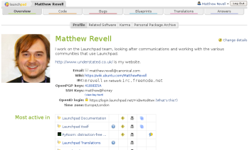
With the release of Launchpad 2.0, we’ve introduced a new, simpler, design and navigation.
Over the past couple of weeks, you may already have seen that we’ve made some changes to Launchpad’s web interface. For a start, there’s our fabulous new logo (designed by Eugene Tretyak) and new silver header bar.
The changes that we think are likely to have most effect on how you use Launchpad are:
- The beginning of the end of the Actions menu: we’ve started the process of removing the catch-all Actions menu. Now, many of the links you use to change information on a page are closer to the information itself.
- Page-wide application tabs: to emphasise the importance of the effect that switching between applications has on the information you’re viewing on the page, we’ve made the application tabs much more prominent.
- New sub-tabs: take a look at your person profile and you’ll see that below the main application tabs are a second row of tabs that switch between pages of different information about your activity in Launchpad. These new sub-tabs appear on many pages and should make it easier to drill down to the info you want.
If you come across a bug in the new web interface, please report it. If you have any other feedback, we’d love to hear from you.