
Focusing on the Launchpad UI
Now that we’ve released Launchpad’s source code, our next couple of months of work are going to be mostly focused on our page layouts.
Launchpad has been around for quite a few years now, and tight release schedules packed with ever-changing features have had the side effect of us ending up with a lot of pages with different layouts.
In the next 2 months, we plan to fix that, and make sure every single page in Launchpad (452 templates!) has our new “3.0 look n’ feel”.
What does that look like, you may ask yourself?
Well, we’re still working on it, as we’re going to change the UI for the navigation (as well as tweak it’s functionality a bit, more on navigation in a future post). We do have rough draft which we’re starting to work towards, figure out what works and what doesn’t with real data, things we didn’t think about, etc.
The first major page we’re converting is the project overview page, currently being worked on by the world famous Curtis Hovey, and the initial draft should look similar to this:
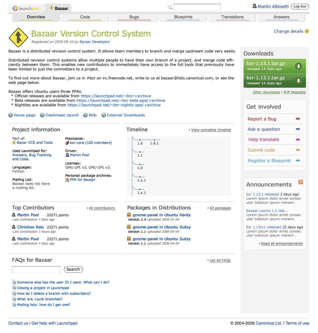
It’s important to note we’re still working on the UI, so the image above is our starting point rather than the end product.
Since it will take some time to make all the changes, we’re most likely not going to make a Launchpad release in August, and jump straight to September. Roll-outs to our edge server will continue to happen daily, and we’ll need your feedback on the changes more than ever. If you’re interested in helping us, just join the beta testers team.
Exciting times! 🙂

July 22nd, 2009 at 8:13 pm
Great news. Appreciate your work.
You could include the search & username in this grey box-style-thing in the top and give the log in/out button an small icon. It’s floating around too much, isnt it? 🙂
July 22nd, 2009 at 8:19 pm
Hi Rabe,
I agree about the floating feeling.
The top part of the page is being re-designed completely as well, so expect to see another blog post in the following week or two about that.
Stay tuned!
July 22nd, 2009 at 9:30 pm
The mockup looks very good!
What I really hope is that launchpad will get packaged in universe every 6 months, if possible in a very modular way – it feels a bit like you are trying to prevent people from using it, which is a bit awkward for free software 🙂 sudo apt-get install launchpad-translations would rock 😉
July 22nd, 2009 at 11:39 pm
Pretty!
Any chance we’re going to hear about planned performance improvements on this blog? That’s the biggest impediment to usability that I currently feel. I don’t know if I should blame those 2-6 second (!) page load times on overloaded servers or on my network connectivity, but I suspect the former.
July 23rd, 2009 at 12:02 am
This is looking quite excellent! One suggestion is that “Register a Blueprint” is not as friendly/clear as it could be as far as wording goes. I’d love to get more ideas for users in my Launchpad project and would love a friendly button to allow for this. Maybe something like “Outline a (Feature|Improvement)”
July 23rd, 2009 at 1:49 am
The message “bazaar does not having a mailing list” is probably also wrong. They probably do, it’s just not associated with this project. Need some more neutral wording there.
July 23rd, 2009 at 12:45 pm
Looks really good! There’s a much clearer call to action with the right hand nav links (though, I agree “Register a Blueprint” might need rewording). The main section of the page is much better organized and easier to follow. Overall, there is much less content and action links floating around on the page, which is a huge improvement. Great work!
A small request/nitpick…Any chance we’ll change the icon for editing items? The exclamation mark in the yellow circle still throws me off every time I see it. Why not a more standard edit item icon (like a pencil instead of an exclamation mark)?
July 23rd, 2009 at 1:19 pm
The problem with “register a blueprint” is that Launchpad does not host blueprints, other wordings might imply this.
I wonder, if it would be possible to gray out the tabs that the project does not use. Most of my projects don’t use translations, and it is disturbing for people to go to that tab, just to read it is not used.
Maybe you could display the most visible bugs alongside frequently asked questions on front page.
Also, some day Launchpad might end up having views for hardware. Maybe this should be taken into account while you are doing a major UI redesign. see http://brainstorm.ubuntu.com/idea/20657/
July 23rd, 2009 at 3:38 pm
Ted, agreed, I will look into it.
Joshua, I will try 🙂
July 25th, 2009 at 11:48 am
That looks great, can’t wait for it :).
Joshua: I think it is a pencil, not an exclamation mark.
July 28th, 2009 at 3:25 am
Appears to be shaping quite nicely, very clean UI. Looking forward to it!
August 3rd, 2009 at 1:36 am
Liking it ^^