Launchpad’s new homepage
Launchpad’s new homepage
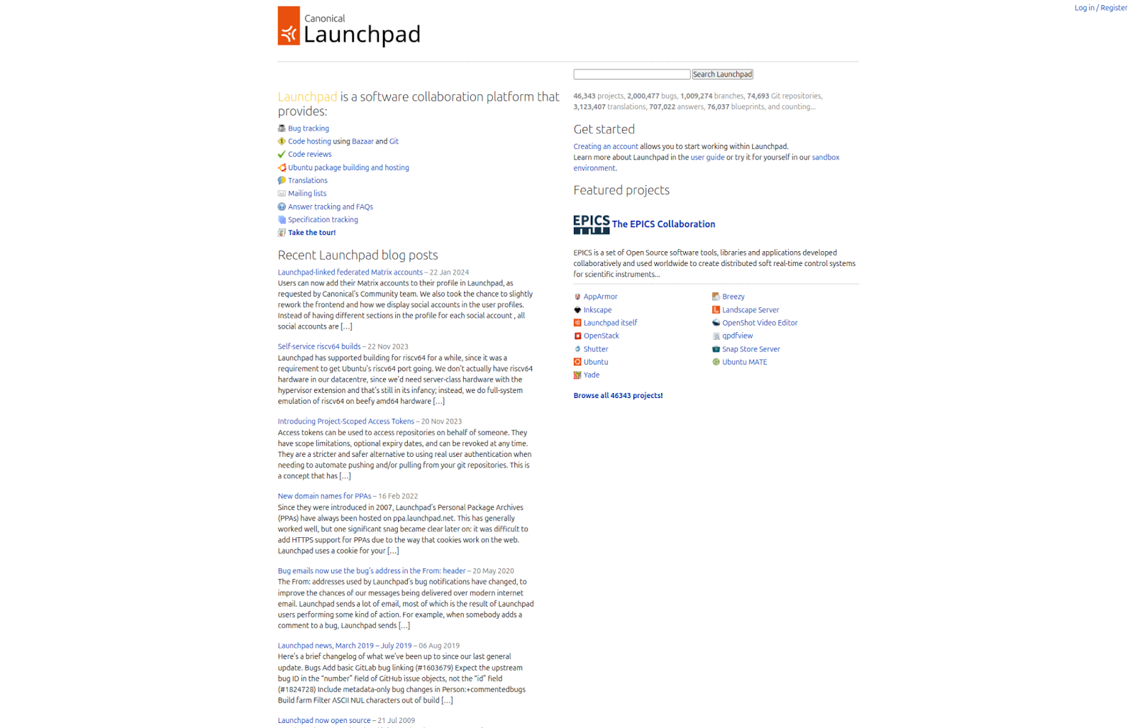
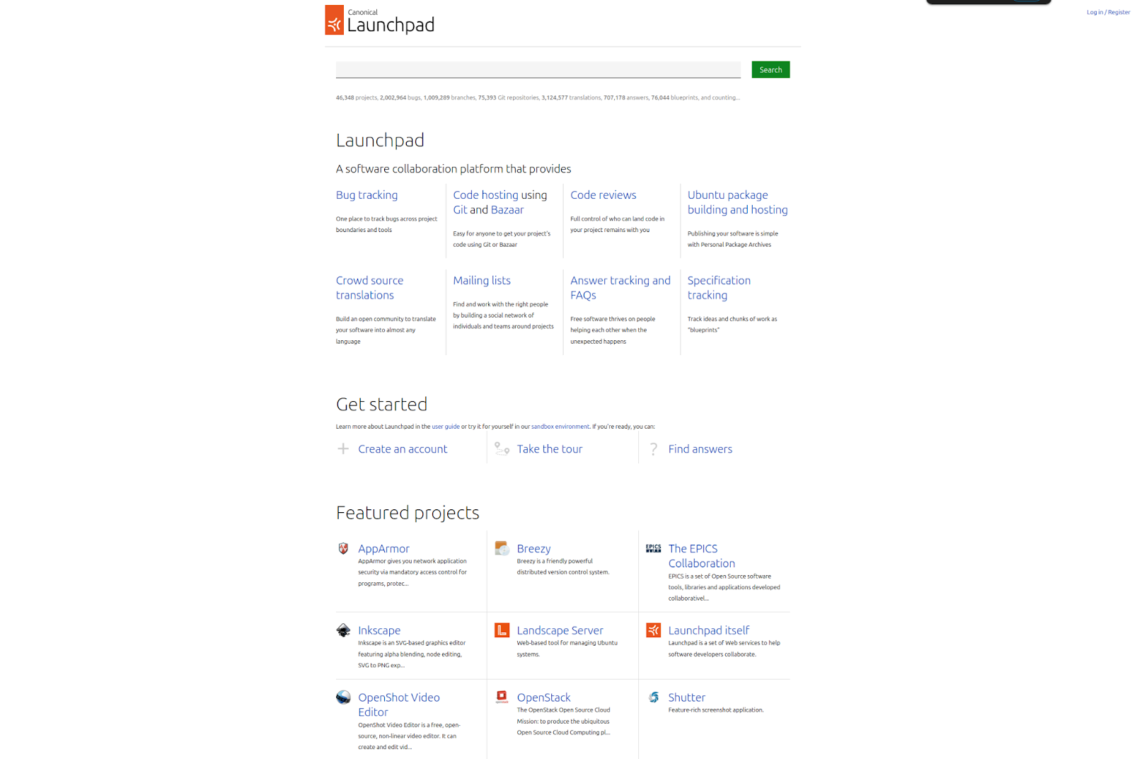
Launchpad has been around for a while, and its frontpage has remained untouched for a few years now.
If you go into launchpad.net, you’ll notice it looks quite different from what it has looked like for the past 10 years – it has been updated! The goal was to modernize it while trying to keep it looking like Launchpad. The contents have remained the same with only a few text additions, but there were a lot of styling changes.
The most relevant change is that the frontpage now uses Vanilla components (https://vanillaframework.io/docs). This alone, not only made the layout look more modern, but also made it better for a new curious user reaching the page from a mobile device. The accessibility score of the page – calculated with Google’s Lighthouse extension – increased from a 75 to an almost perfect 98!
Given the frontpage is so often the first impression users get when they want to check out Launchpad, we started there. But in the future, we envision the rest of Launchpad looking more modern and having a more intuitive UX.
As a final note, thank you to Peter Makowski for always giving a helping hand with frontend changes in Launchpad.
If you have any feedback for us, don’t forget to reach out in any of our channels. For feature requests you can reach us as feedback@launchpad.net or open a report in https://bugs.launchpad.net/launchpad.
To conclude this post, here is what Launchpad looked like in 2006, yesterday and today.

Launchpad in 2006


Tags: front-page, launchpad


April 30th, 2024 at 10:49 am
Images seem to be broken. Looks like they are hosted on google and it’s not serving them?
May 27th, 2024 at 5:21 am
The images embedded in this post are broken and I don’t seem to be seeing them. Though, The Launchpad’s new design is looking fantastic.
December 9th, 2024 at 5:31 pm
Thanks for the report, Yasar. The broken images have been fixed and are now visible.