Logo competition closing soon!
This past few weeks, we’ve had a whole load of high quality entries to our logo competition. We’re heading fast towards the 31st March deadline, so if you want to take part you’d best fire up Inkscape pretty sharpish!
Back in January I shared a couple of the entries we’d had at that time. As a bit of inspiration, in case your arty side is twitching, here are some of the proposed logos we’ve had since.
Donn Ingle’s sixth entry to the competition introduces a touch of the natural world:

Siim Sindonen’s stylised blue rockets show the community support between projects, people and teams in Launchpad:

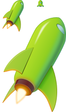
Thorsten Wilms offers this shiny green rocket:

And Marco Tessarotto’s entry puts me in mind of Marvin the Martian but I’m not sure why:

See all the entries on our submissions page!


March 17th, 2008 at 6:21 pm
Why so many rockets and no launchpad?
By the way, the first is better. The others are too cartoonish.
The 2nd one seems like one is humping the other. Remember me one alternative icon for the Firefox browser.
April 5th, 2008 at 12:33 pm
Actually I find the current logo the best. 😉 A lot the submissions are really good and beatiful, but I don’t see a reason why Launchpad should get a new logo.
The current design and logo are pretty enough in my eyes. So I’m curious why Launchpad wants a new logo.
April 7th, 2008 at 10:33 am
I attempted to make an actual launchpad: https://help.launchpad.net/logo/submissions#head-c7851b230c520dac2dadb67d581982262a4a6130
https://help.launchpad.net/logo/submissions?action=AttachFile&do=get&target=medigeek_LPb.svg
The problem is that it’s too simple, but I’m doing this for fun 🙂
so… who won? the logo contest was over a week ago!