Launchpad’s UI is evolving
Thursday, February 17th, 2011We are updating the UI over several iterations over the next few weeks for several reasons:
- Launchpad should apply the Canonical guidelines for websites to take advantage of the research done for other sites. Being consistent with other Ubuntu and Canonical sites means there is less for users to learn about what the presentation means.
- Launchpad has 730 style rules. Most are dedicated to defining exceptions, not standards. 730 rules is too much, too much for developers to maintain, too much for users to understand.
Many users have remarked about Launchpad’s recent the loss of colour. We did this because:
- It is hard to learn the meaning of so many colours.
- It is confusing to see headings of different colour that have the same meaning.
- Answers and Blueprints used blue, the same colour as links.
- There were inappropriate uses of green that confused users who know that green means “perform an action without leaving the page”.
- The were uses of orange and purple that users might mistake for Canonical’s aubergine and Ubuntu’s orange.
We appreciate your feedback, and we would like to hear more. There are also legitimate concerns being raised and we are not surprised because they are the same concerns we discussed.
1. Headers are harder to identify
Indeed they are. The old colours were hiding the font-size and whitespace issues that are still present in Launchpad. I am working on this issue right now. Launchpad uses many font sizes, and the percentage mechanism used does not render the size developers intend (font size smaller than default creates accessibility and usability difficulties). I think headers will be easier to understand when there are fewer, but distinct, font-sizes being used.
2. Buttons, callout actions, are hard to find
The links to report a bug for example look like normal links. They are hard to see. These important actions are no longer callouts. The only action that users can still find is the green download button…but that green does not mean “perform an action without leaving the page”. This is bad. We do know what to do about this yet. Maybe you can help. I think they need colour, they may need iconography. Look at http://www.ubuntu.com/ to see an example button and callout links. Launchpad does not have a colour at this moment. Launchpad does not have an obvious position along the axis described in the website guidelines (Canonical, corporate, aubergine)..(Ubuntu, community, orange). Launchpad definitely has both aspects; Canonical created Launchpad to build Ubuntu. I think there is a second axis for upstream projects (corporate and community, hosted and mirrored, Ubuntu and other OSes) that might need a colour. Most of the links that I think of are about participation in community, so I favour orange. But is this right? Does the orange also mean Ubuntu to non-Ubuntu users? Will the use of orange stop users from reporting a bug in the OpenStack project?


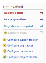
 Projects get an improved “Get Involved” portlet. This portlet provided links to create projects artefacts like bugs and branches. It was never clear though how to enable these links. Privileged users like project owners will see links to configure Launchpad applications. The portlet also call attention to applications that are not configured.
